Just one more thing.
I covered a lot of ground on the debt ceiling and a U.S. default in last week’s article, Danger Ahead?, and I’d be content if that was the only analysis from me you read on the topic.
But, upon reflection, I want to reframe the analysis to provide a little more context as the debt limit deadline approaches.
In last week’s article, I discussed how gold and stocks (measured by 500 Index, VFIAX) performed during the summer of 2011 when a previous debt ceiling debate was raging (there’ve been many) and Standard & Poor’s downgraded the U.S.’s debt rating from AAA to AA. What I’d like to do this week is show the performance of both gold and stocks on the same chart and bring some other major asset classes—bonds, cash and real estate—into the analysis.
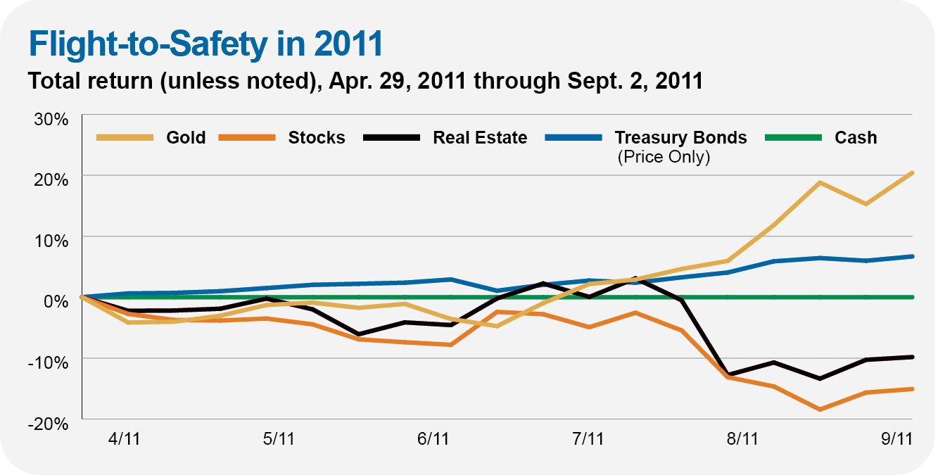
The chart below uses weekly data to plot the performance of gold, stocks (Total World Stock Index, VTWAX), real estate (Real Estate Index, VGSLX), Treasury bonds (Intermediate-Term Treasury, VFITX) and cash (Federal Money Market, VMFXX) during the four months from the end of April 2011 through August 2011. Note that as I’m using weekly data, I’m showing price returns for Intermediate-Term Treasury—add in the interest distribution and the fund did a bit better than shown here, but it doesn’t change the story over a four-month period.
This four-month run looks like the classic “flight-to-safety” trade to me. “Risk” assets (stocks and real estate) sold off while supposedly “safe” assets (gold and Treasurys) gained ground. (Cash sailed along, earning next to nothing.) Let me emphasize that Intermediate-Term Treasury was still a safe destination—gaining 7% without counting interest—even though a government default was on the table.

To bring us up to date, let’s look at how those funds (and gold) performed from January 27, 2023 through May 12, 2023. (If the Treasury coffers run dry in the beginning of June, starting our analysis at the end of January gives us a similar four-month window.)